Member-only story
Create a Popover In Svelte
How to create a popover in Svelte without any other libraries or dependencies.
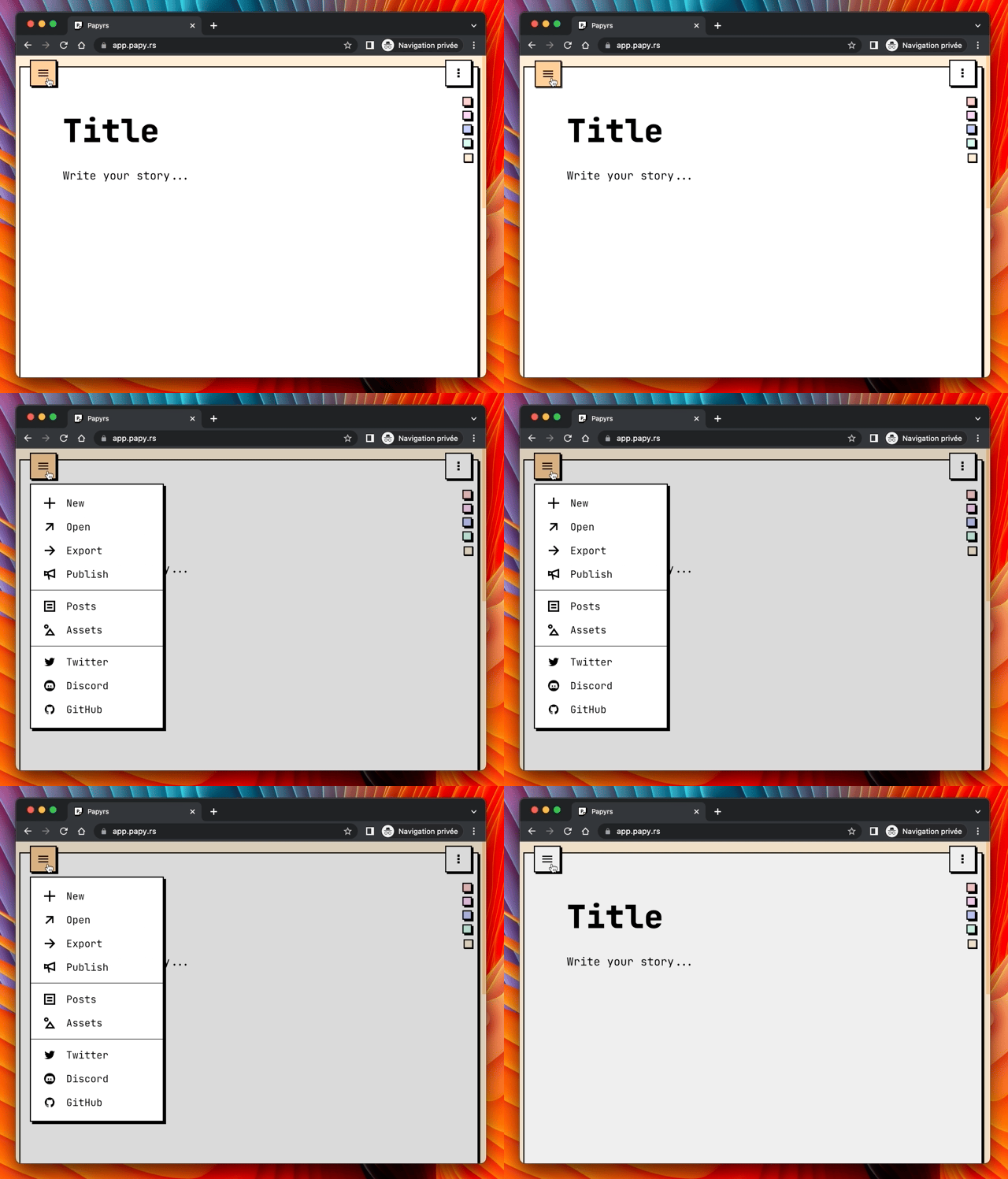
I have implemented the UI components of my last project Papyrs without any third party design system libraries — i.e. I created all the components from scratch. I did so to get full control and flexibility over the miscellaneous bricks of my opinionated layout.
In this blog post, I share how you can develop a popover component in Svelte.

Skeleton
A popover is a floating container that is rendered over the content next to an anchor — commonly a button — which initiates its display. To improve the visual focus of the overlay, a backdrop is generally used to partially obfuscate the view behind it.
We can start the implementation by replicating above skeleton in a component named Popover.svelte which contains a button and div.
<button>Open</button>

<div
    role="dialog"
    aria-labelledby="Title"
    aria-describedby="Description"
    aria-orientation="vertical"
>
    <div>Backdrop</div>
    <div>Content</div>
</div>
To improve the accessibility we can set the dialog role and provide some aria information (see MDN docs for more details).
Animation
We create a boolean state — visible — to display or close the popover. When the button is clicked, the state is set to true and the overlay gets rendered. On the contrary, when the backdrop is clicked, it turns to false and it closes.
In addition, we add a click listener on the popover that does nothing else than stopping the event propagation. This is useful to avoid closing the overlay when user is interacting with its content.
We can also make the overlay appearing and disappearing gracefully thanks to the transition directive — also known as “Svelte’s black magic” 😁.

